- You have not saved any projects.
Town
With one successful collaboration already under his belt, Pierre Bader, a local restauranteur, approached Shook Kelley to collaborate on a second restaurant concept within the Gateway Village development in uptown Charlotte, N.C.

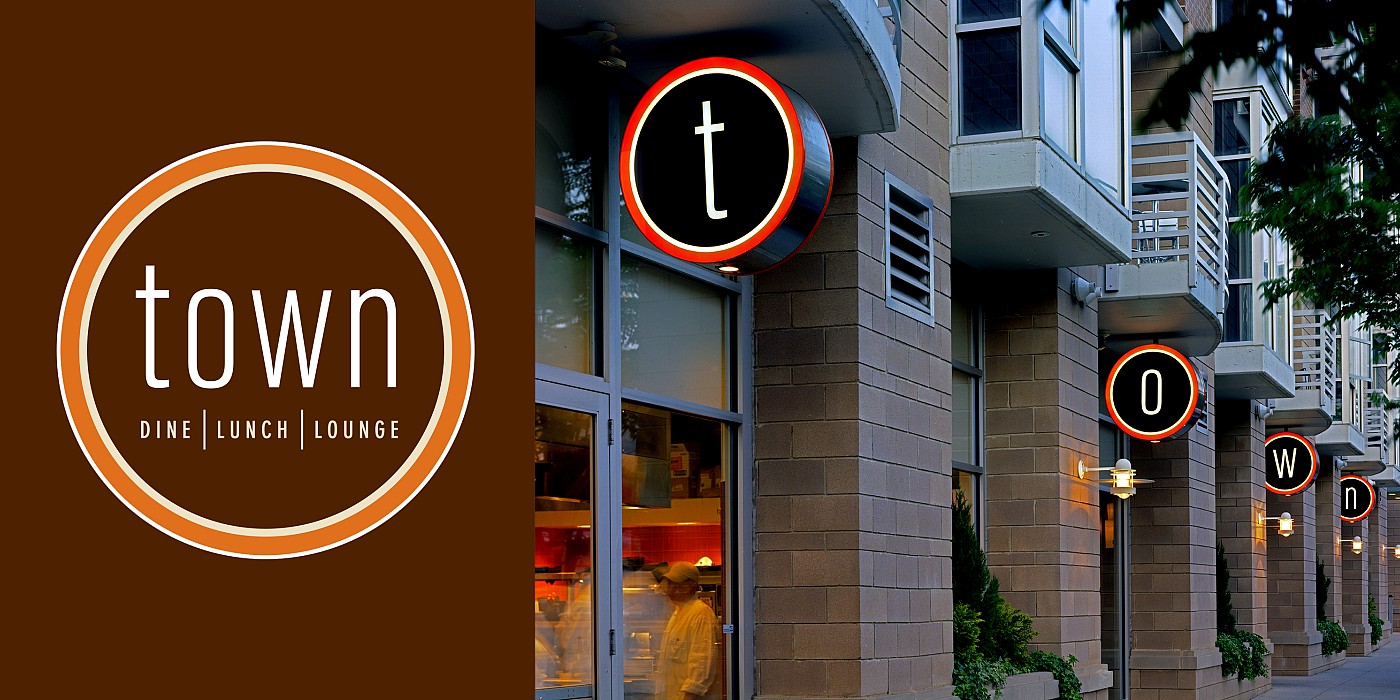
The restaurant featured an exhibition kitchen, a main dining area, a lounge and bar area and also a private dining space. All of these spaces were open and designed to visually pull the viewer’s eye through the energy of each space and towards the back wall, which was the primary focal point of the restaurant.
The exhibition kitchen was designed as a room with nothing to hide
A subtle, hot-cool theme helped articulate the space, with the kitchen being the hottest space, and the lounge and bar area being the “coolest.” Visible from the street, the exhibition kitchen was designed as a room with nothing to hide, and featured a bright, red-orange tile backdrop and a 360-degree prep/hood area. The main dining room was defined by large, communal tables that were centrally located, with intimate banquette seating backed by vertical mirrors along each side of the room. The lounge and bar area was a fabric wrapped cocoon of flexible sectional seating and ottomans, with a loosely Asian-inspired backlit bar-back and quartzite bar-top along the rear wall. The private dining room was defined by a cylindrical drum element suspended from the ceiling, which supported a curved three-dimensional art installation that also functioned as the backdrop to the curved banquette and flexible, communal seating.
Throughout the space, the finishes were primarily a palette of earthy neutrals, stained wood, raw concrete and semi-exposed raw ductwork and sprinkler systems. The only non-neutral color—an earthy red-orange—was used to visually tie the rooms together via fabric, paint and tile.